

For this project, my role is UI designer. So I didn't do much research. Therefore, this page will mainly explain the design direction and function. First, this app is used to assist the use of suiteCRM. This app allows users to manage their company's data anytime, anywhere. Because it is an app used by suiteCRM. So most of the functions are the same as the main functions of suiteCRM.
In terms of design style, try to keep the app simple and consistent. Due to the large amount of data involved in the app, most of the interfaces will be presented in the form of lists for the convenience of users. Hope it can bring users a simple and easy experience

I'm sure some of you have heard of suiteCRM. He is a system developed based on SugarCRM. It is a system that can help companies conduct data analysis and record customer information. Thereby establishing the bond between the company and the customer. And I won't go into detail about the history.
Our company has found that there are not many apps on the market that assist in using suiteCRM. So the company wanted me to design an app to assist in using suiteCRM.


My design direction has never been away from simplicity and consistency.
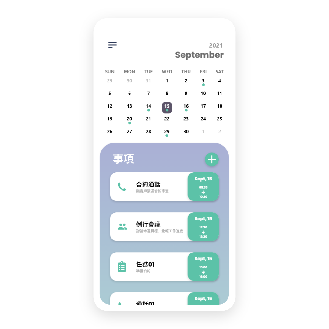
First of all, in the home page, I want to have a calendar and a task list below it to remind users of the tasks of the day.
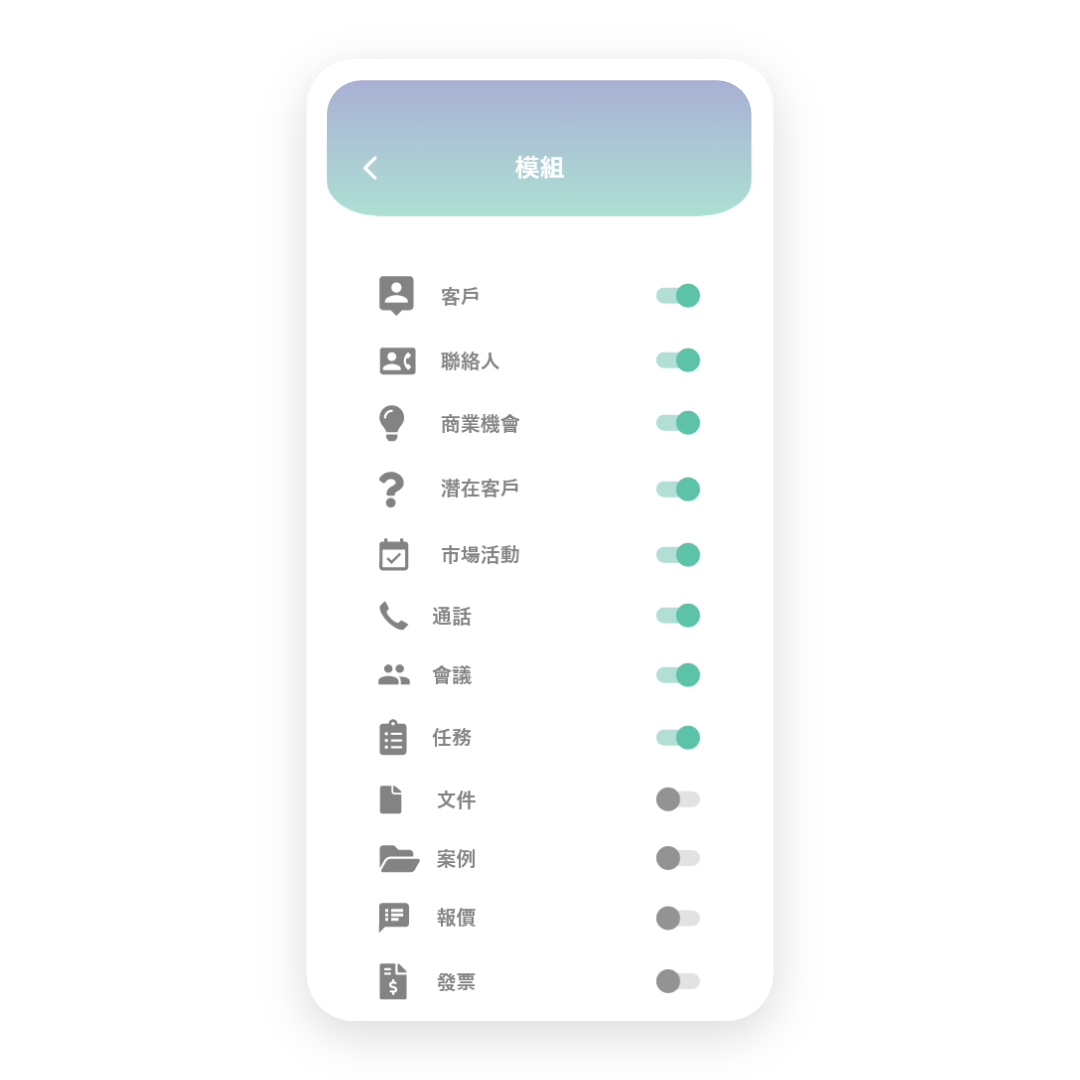
In addition, because the function of suiteCRM is too much. So I plan to let users choose which functions they need to use. You can hide it when you don't need it. This will make the interface more concise.
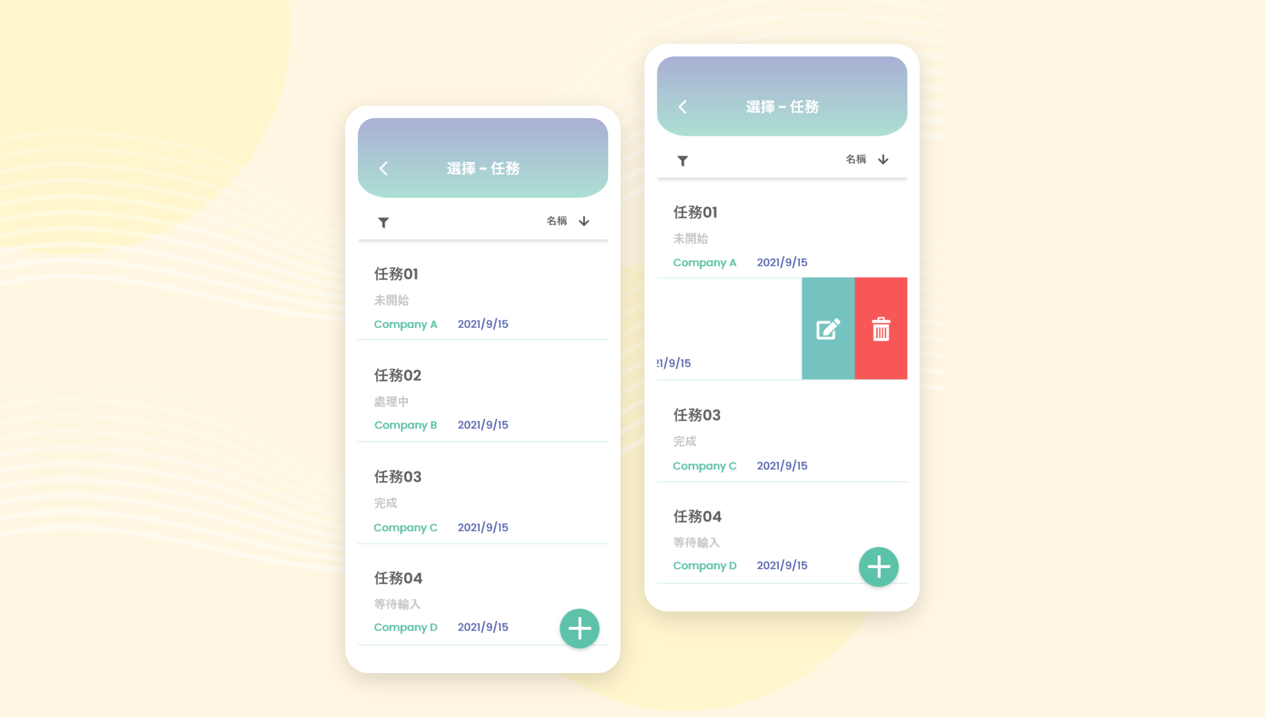
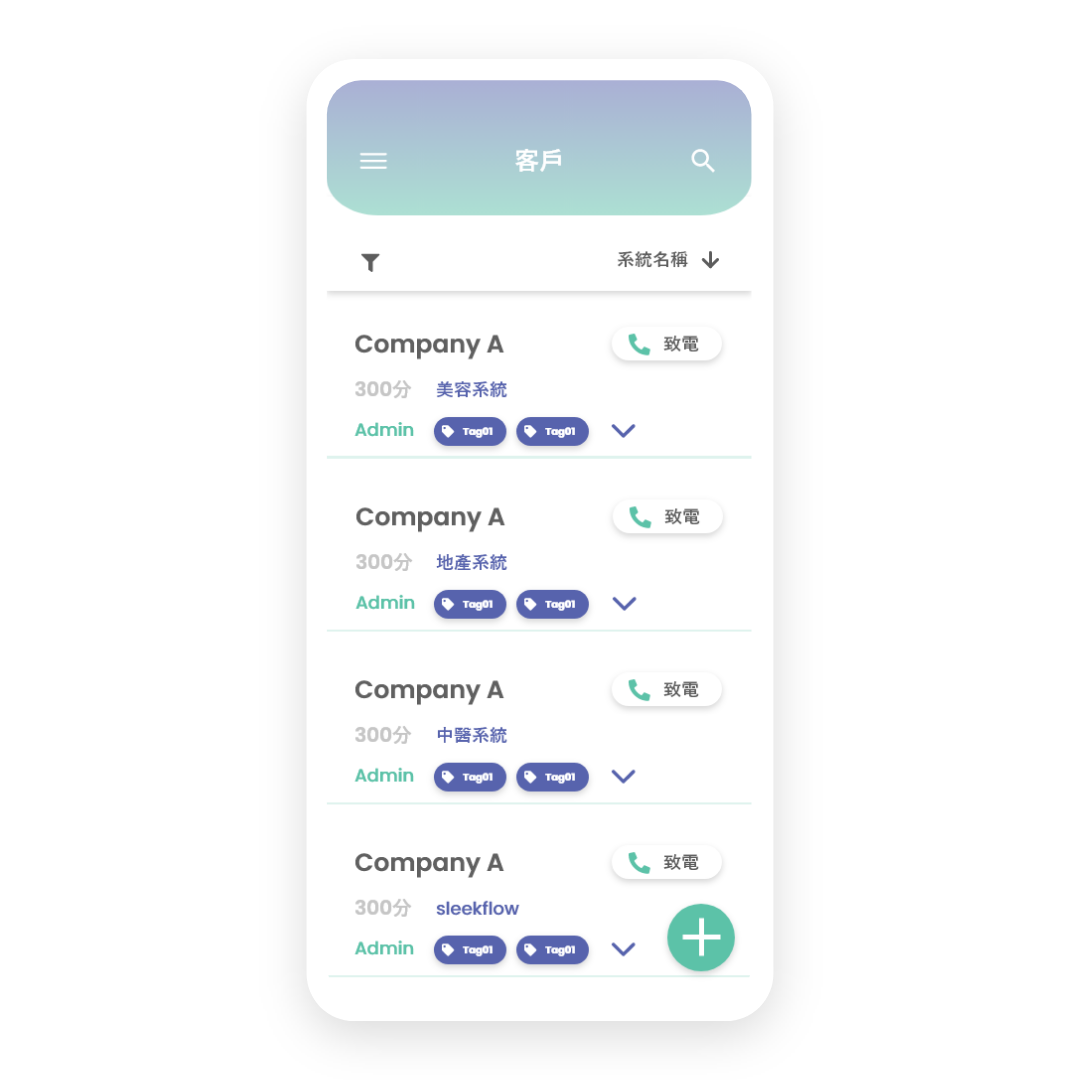
The data aspect will always be presented in the form of a list. Because of too many kinds of data. If each type of data is presented in a different way it can confuse users. So there must be consistency in the design.
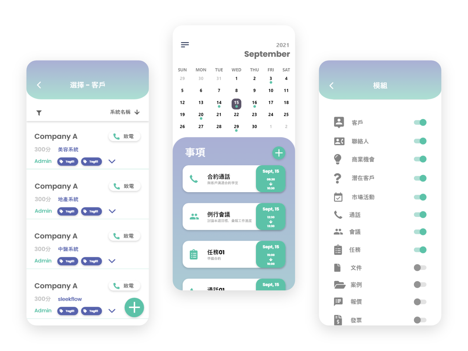
The design content in prototype is roughly the same as wireframe.
The main difference is the aesthetic aspect. In order to make the user look more comfortable. So use more round shapes to design components.
The functions and data presentation methods are roughly the same, and they are displayed in the form of a list. The only difference is that I have added a call button to the customer list so that users can call their customers directly. In addition, I added different tags to allow users to better filter and search for the customers they want.
Pain Point 1:
There are too many functions in the original CRM. How do we condense these functions into the app. Make the app not overly complicated.
Pain Point 2:
Even with tasks established, it's easy to forget what needs to be followed up on that day.
Pain Point 3:
A lot of data in CRM is related. For example a client may be involved in a meeting or a call. How do we present these relationships in the app.
Pain Point 1 Solution:
A function can be added to allow the user to set which functions are required. Users can hide unwanted functions to reduce clutter.
Pain Point 2 Solution:
Need to add a calendar on the home page and display the task list for the day. In order to prevent users from forgetting what they have planned for the day, I will add a notification function to remind users.
Pain Point 3 Solution:
We can add an extra page to each data detail page to display the relationship between the data.
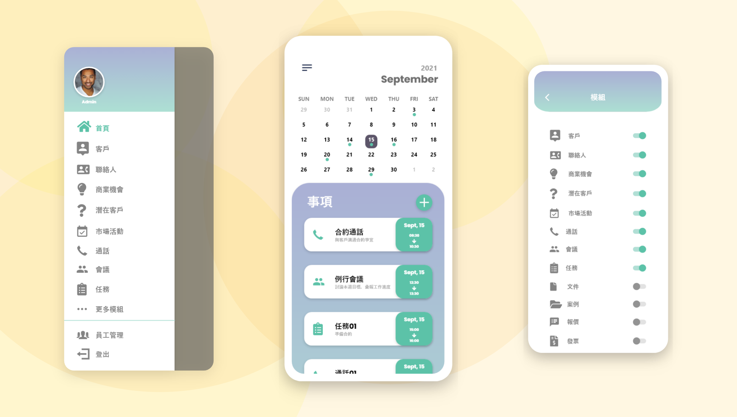

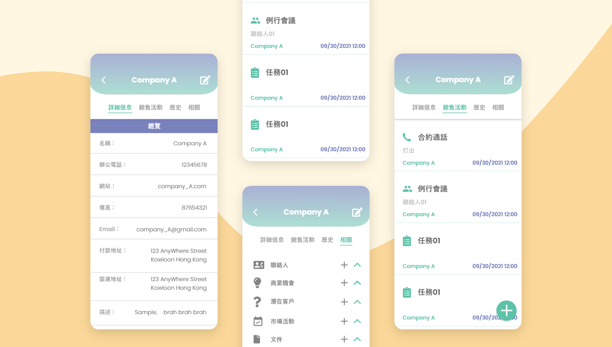
Still worried about forgetting to meet with clients?
With a CRM app, you don't have to be afraid to forget what's planned for the day.
Whether it's a meeting, a task, or a call, we will help you list them one by one.
Afraid of losing potential customers in front of you?
Use the app now to track your customers.
Take a look at your client's details and talk to them about your partnership opportunities!
The interface is more concise than the original system!
But this does not mean that there are fewer functions inside than the original system.
In order to give users a better experience. Most of the functionality will remain in the app.
At the same time, the data of the app will also be synchronized with the original system, so there is no need to be afraid of inconsistency between the data of the app and the original system.
What I Learn?